Virtually all of the work I did at JLR remains bound by NDA.
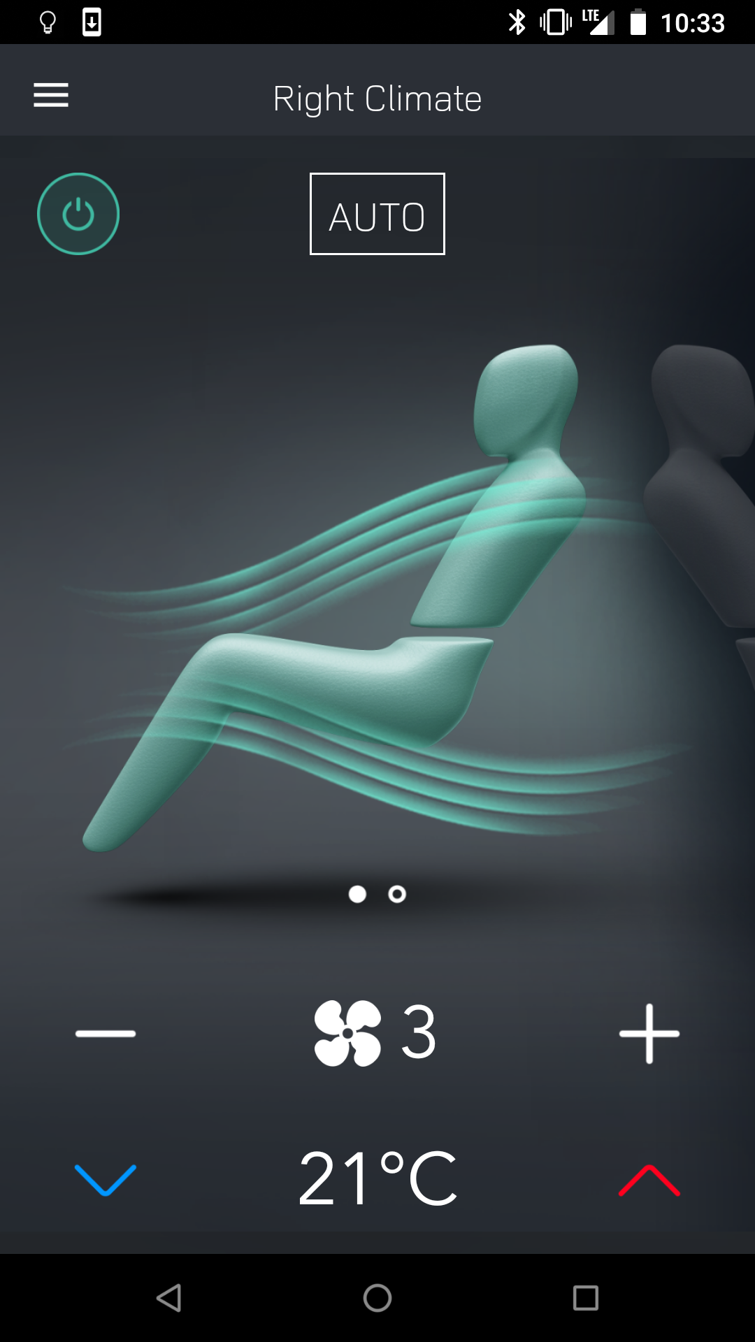
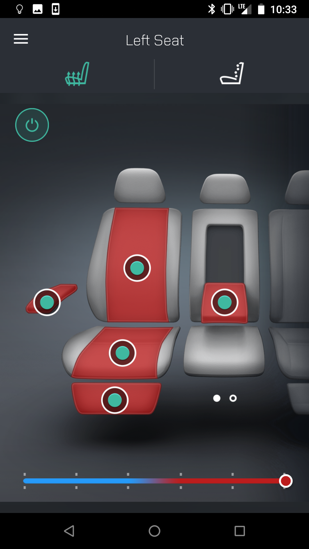
I did interaction design for a project that eventually became the Land Rover Comfort Controller App. The app istelf is a bit rough around the edges, but the interactions are as I specified. The app was released two years after I did initial design. Once the app was designed in Portland, it moved to offices in the UK to be readied for production. It was released in spring of 2018.
This app allows rear-seat vehicle occupants to control the rear seat comfort functions (HVAC, heated/cooled seats, massage).
This screen controls the HVAC functions for rear passengers.This screen controls the Seat functions for rear passengers.
2013 - 2015
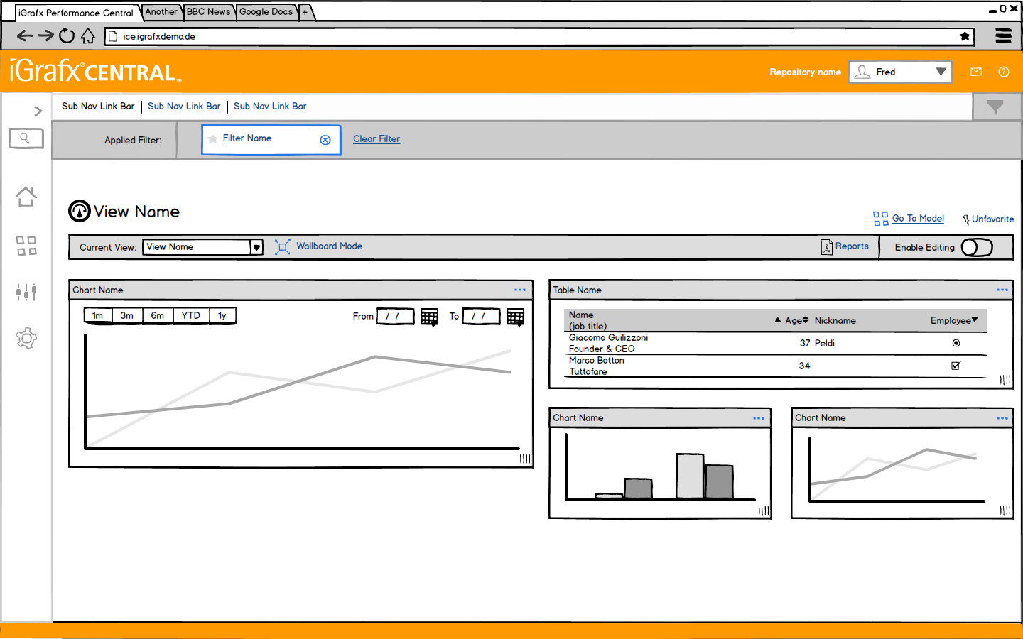
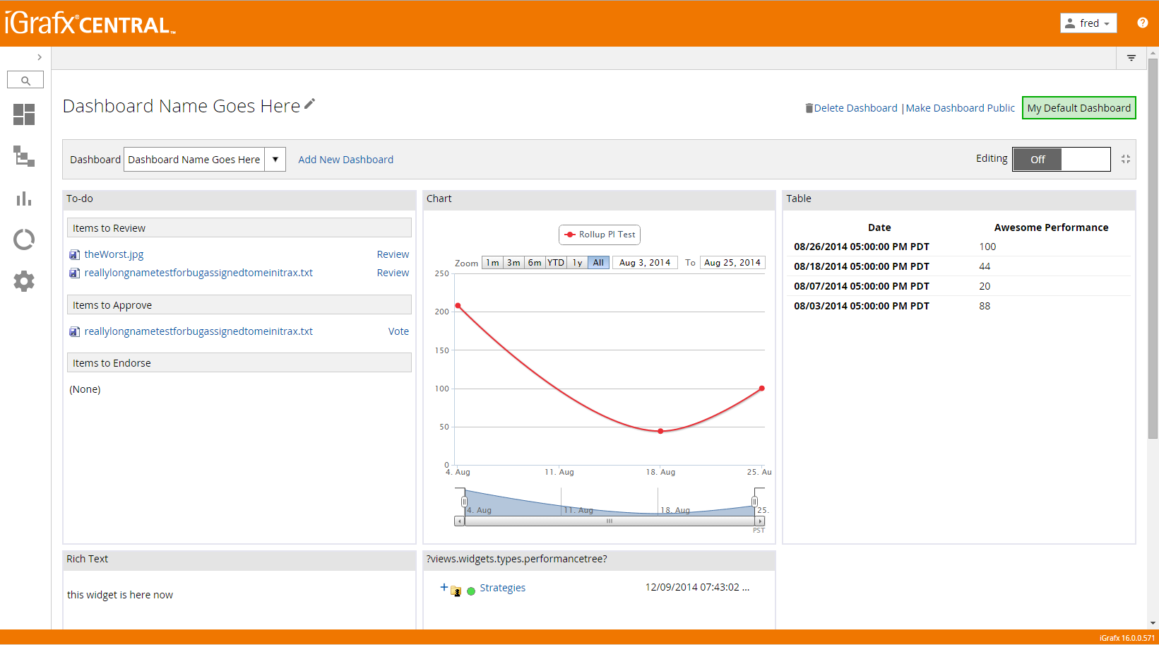
iGrafx
iGrafx Dashboards
iGrafx Dashboards allow customers to view many things about their Enterprise Model in one place.
The Balsamiq wireframe for the user's dashboard.The final version of the user's dashboard.
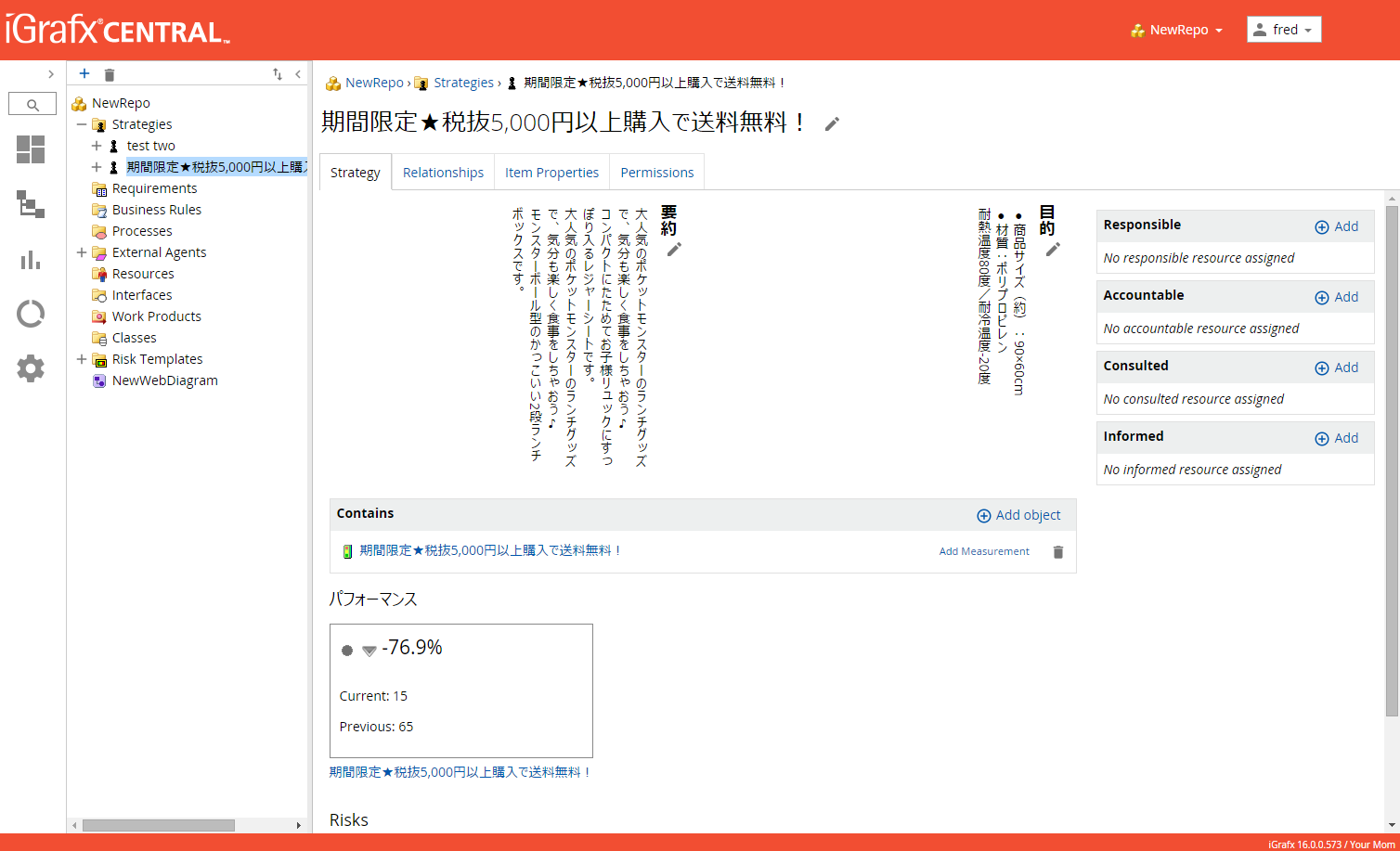
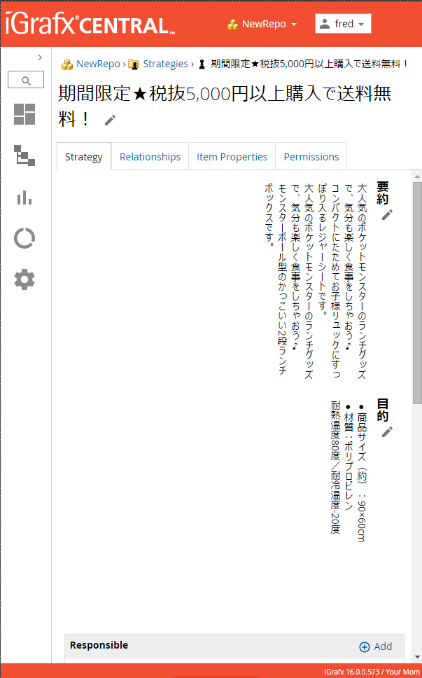
Japanese Text Support
iGrafx has customers all around the world. To better support the cultural needs of our customers I worked to use new CSS3 features to support the appropriate display of native text wherever possible. This also shows some of the responsive design work I did.
You'll notice this sample is a different color. The iGrafx platform allowed for themes and I often switched between my favorites (I designed and wrote the CSS for all the themes).
An example of Japanese language text being displayed vertically right to left, the traditional formatting for Japanese.The same screen as above, but with a smaller viewport to display the responsive nature of the design.
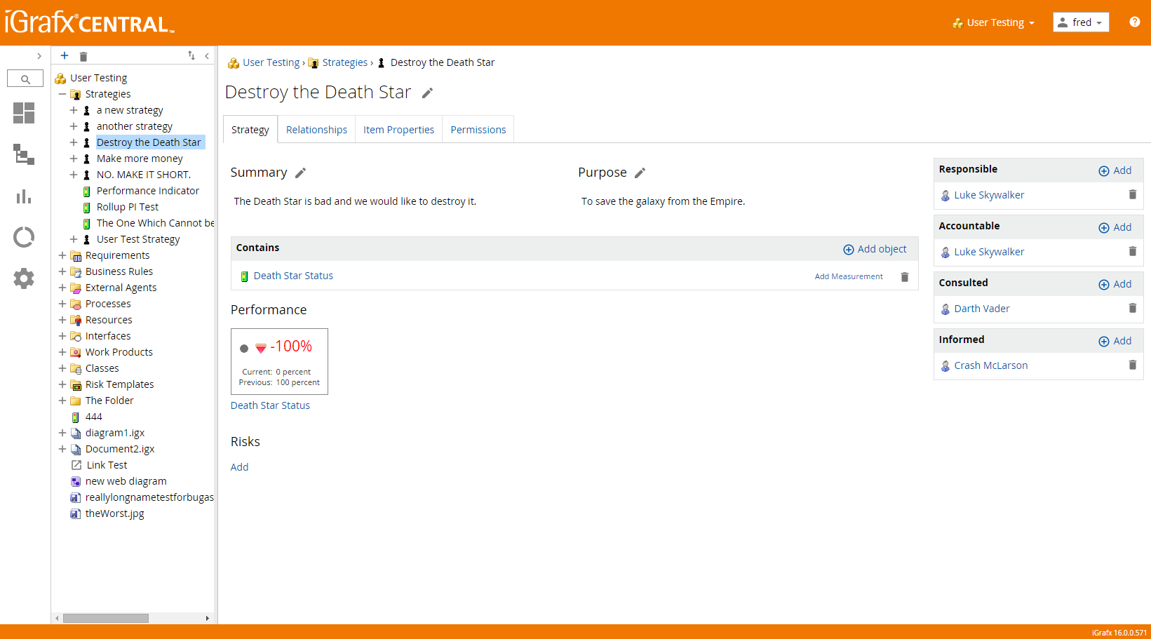
Enterprise Modelling
The heart of the iGrafx product is enterprise modelling. This is one type of enterprise object page.
Enterprise modelling had many facets. This is a "strategy," a type of task a business can work against and track.
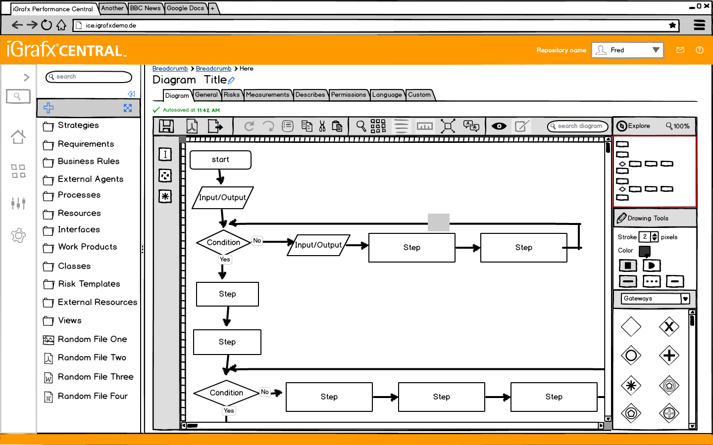
Web Diagrams
Much of the work done to create an enterprise model also involves diagrams of processes. This is an early design for an web-based diagram editor.
Strategies and other objects in the Enterprise Model would be used in these types of Diagrams. This feature was eventually developed using HTML5 Canvas. This was made in Balsamiq Mockups.
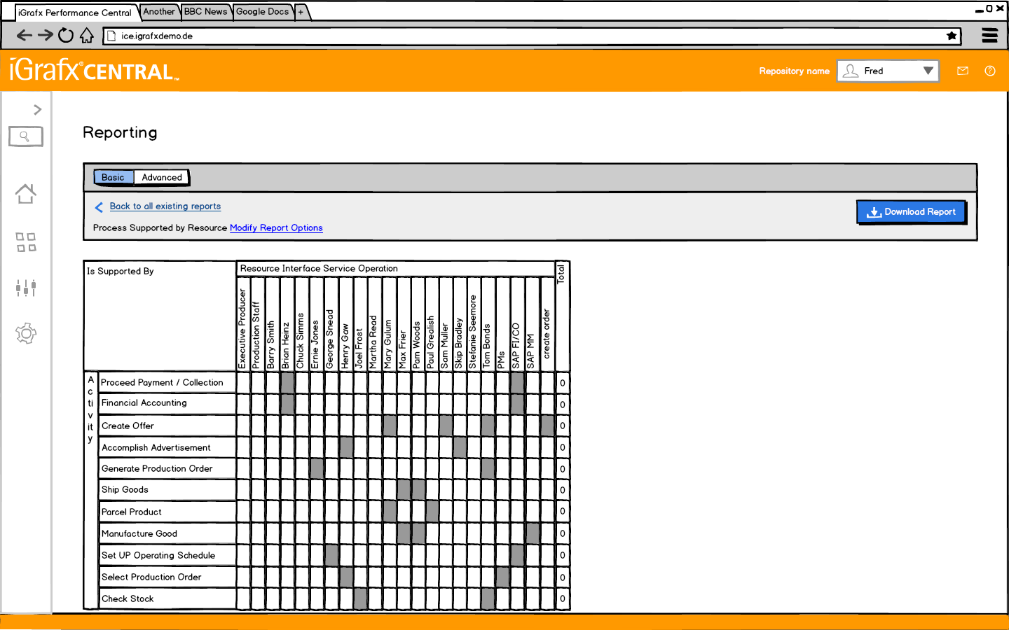
Reporting Engine
I designed a system that allowed users to query their enterprise models to generate various reports. Businesses love reports.
A Balsamiq Mockup of the reporting engine.
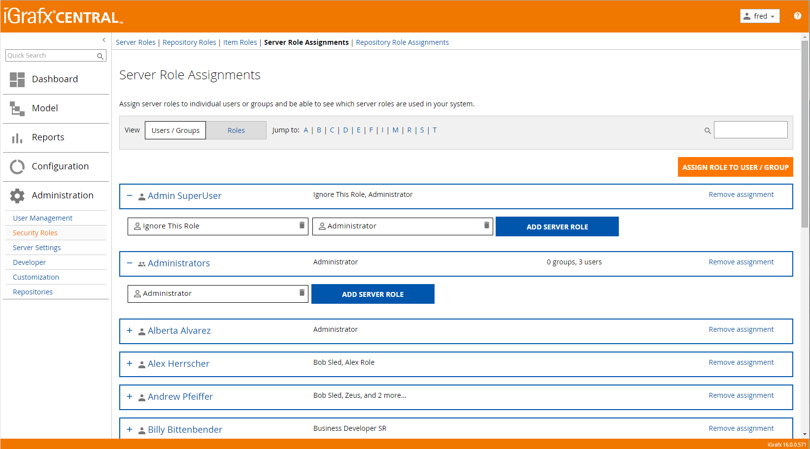
User, Group and Role Management system
Administrative users need a way to manage users, groups and security roles. This is part of the system I designed.
As in any shared system, roles and permissions were very important at InComm.
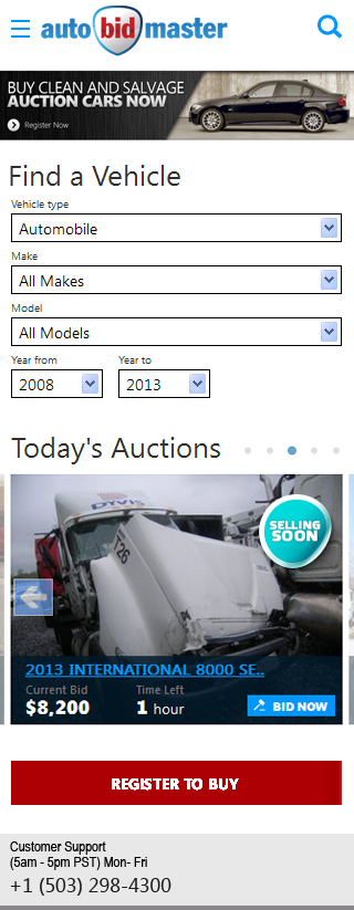
AutoBidMaster
AutoBidMaster Mobile Concept
Mobile was a large percentage of AutoBidMaster's traffic when I started working there. This was one of the possible solutions under consideration.
Remember when you had to convince people that supporting mobile devices was important?
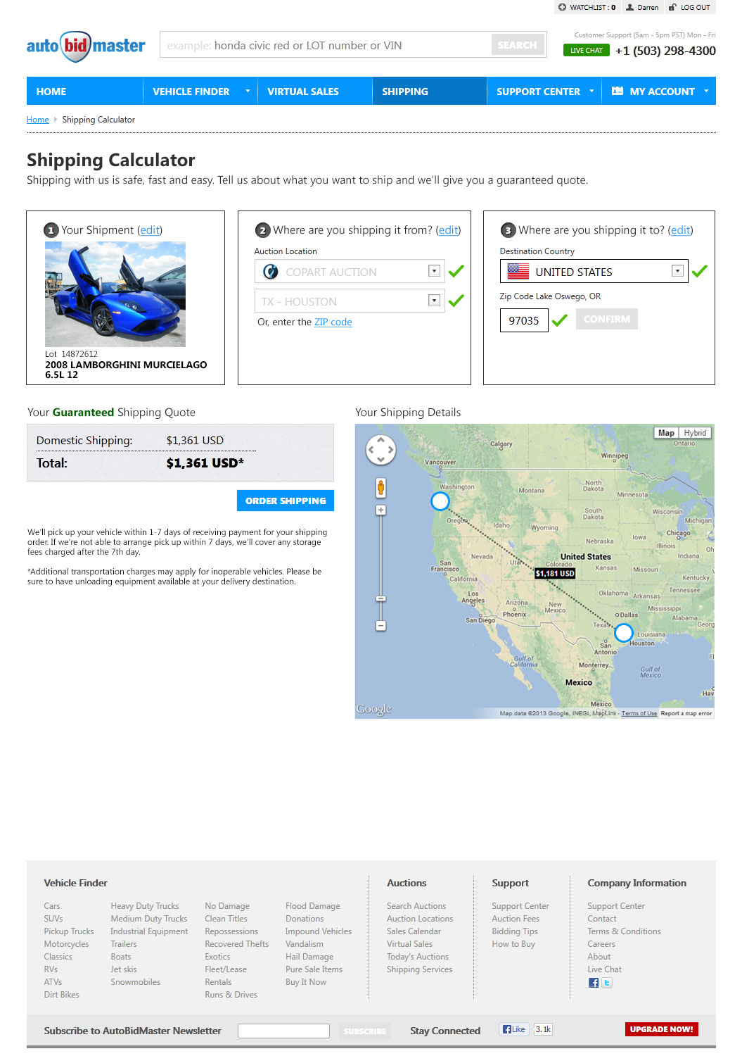
AutoBidMaster Shipping Calculator
AutoBidMaster offers help to users who want to ship the vehicles they win at auction. This shipping calculator will help sell shipping by better showing the value of what the user is ordering.
Shipping cars is surprisingly affordable.
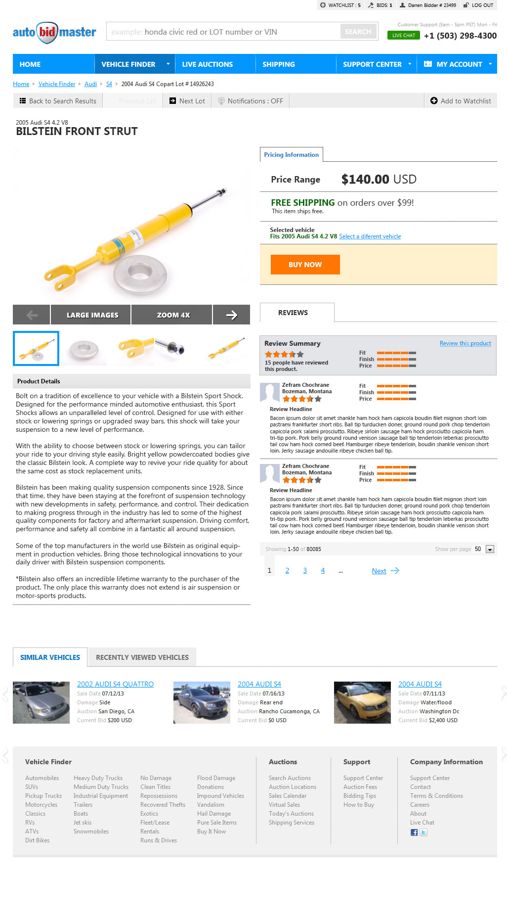
AutoBidMaster Parts Product Detail Page
I was asked to come up with what it might look like if AutoBidMaster were to offer parts to users. This is what I delivered.
Another Product Detail Page. Remember designing in Photoshop? Click to embiggen (but it really just opens in a new tab).
Work Samples
Job Interview Samples
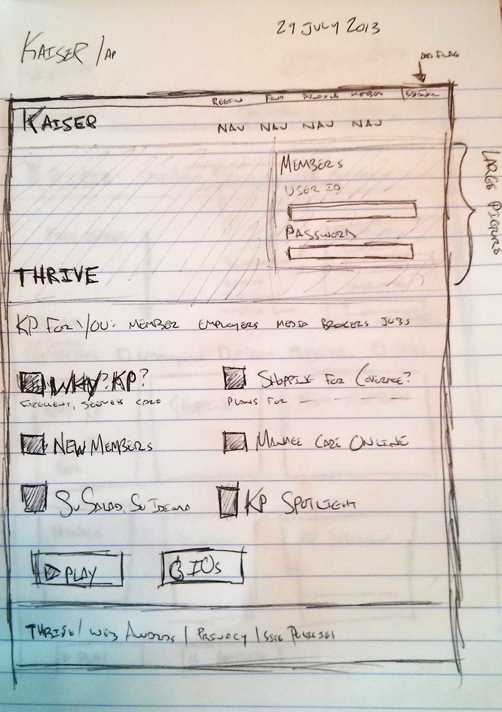
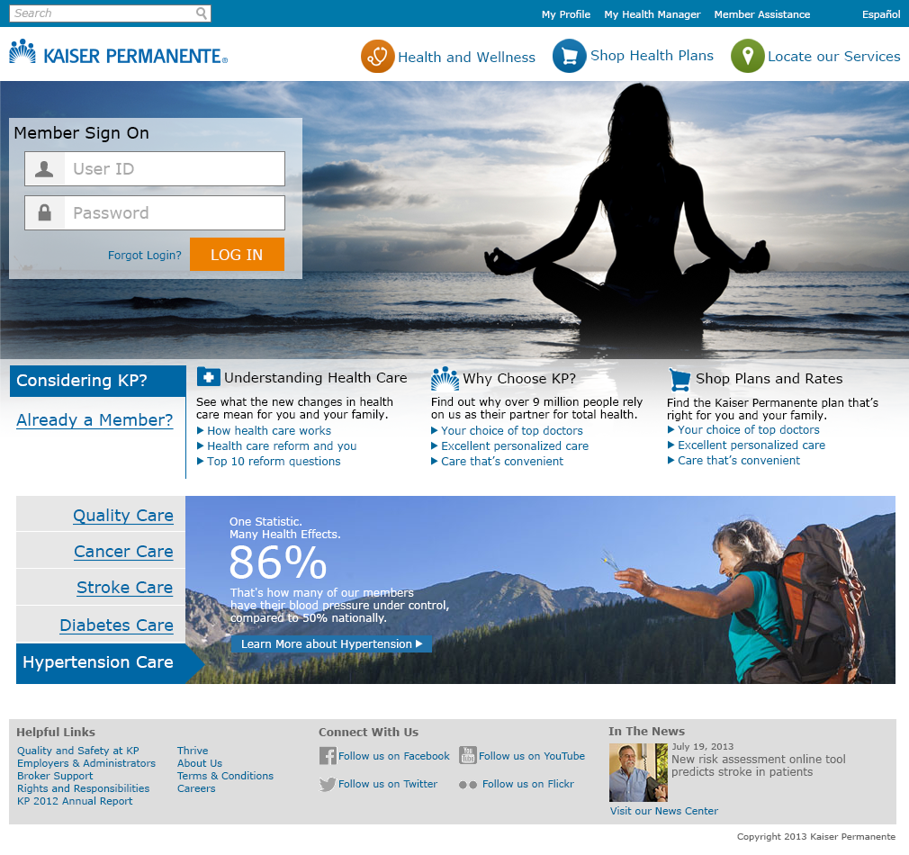
These are samples I have worked on for potential employers. There were not for Kaiser, but Kaiser was the website I was directed to look at. I started as I sometimes do, with a hand-sketched wireframe.
I do still sometimes sketch ideas. I also like to whiteboard.After sketching I went into high fidelity. Those were different times.
2011 - 2013
MotoSport
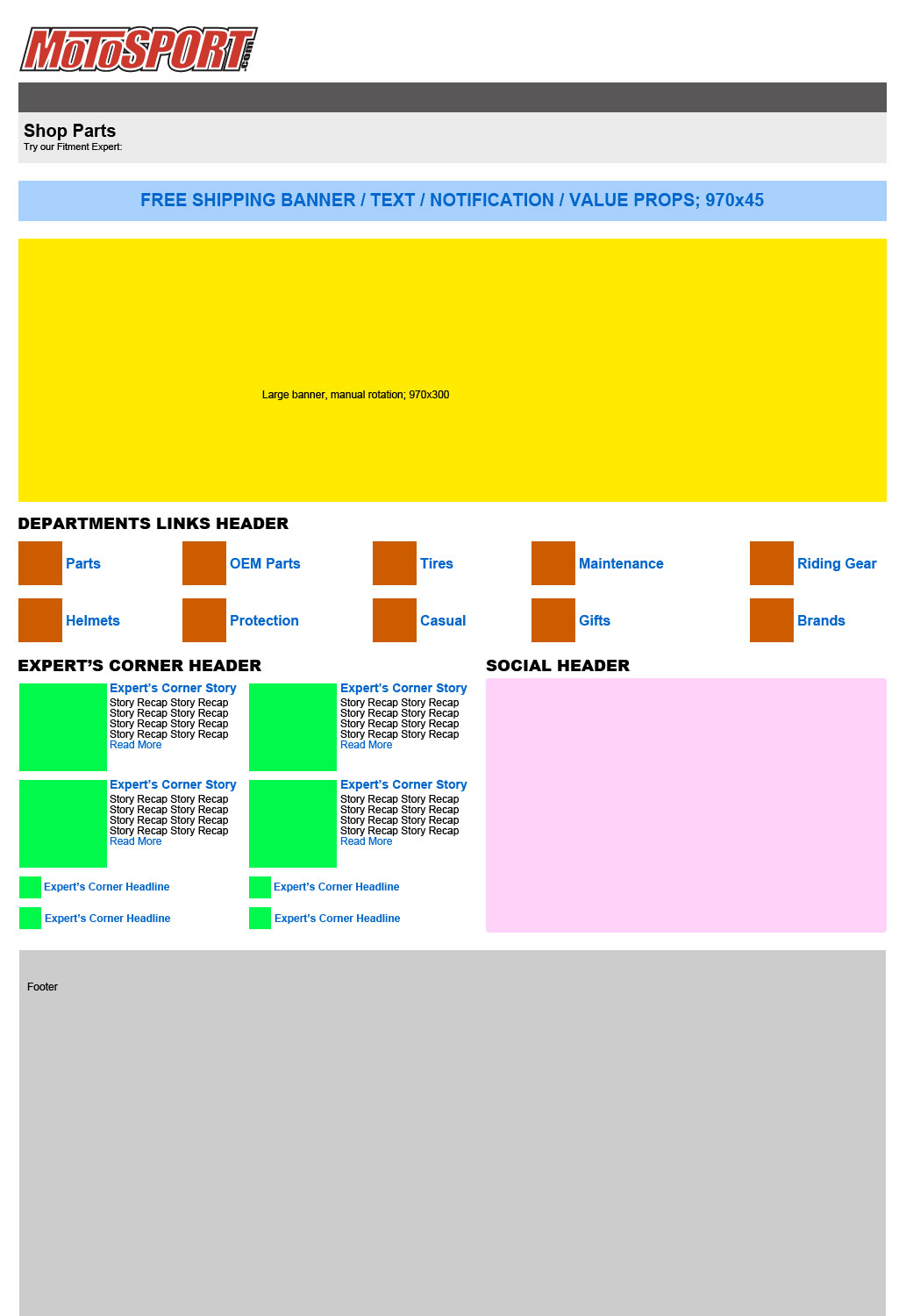
MotoSport "Storefront" Wireframe
This is an example of a wireframe I created. The wireframe serves as a first step before a high fidelity mockup in many projects. This wireframe is meant to solve issues we found on our "storefront" pages during user testing.
MotoSport had a confusing concept of "storefronts," where content was segregated based upon the type of motorcycle customers wanted to shop for. It was a hold-over from the days of the mailed catalog.
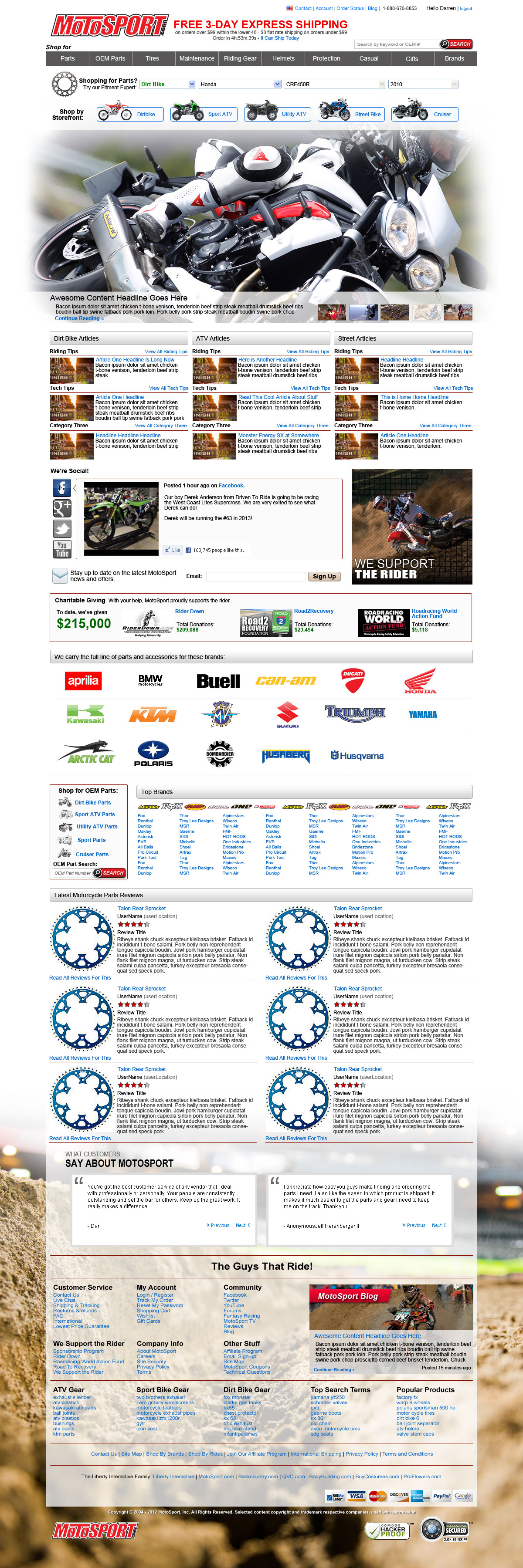
MotoSport Home Redesign
I designed a new main landing page. The content of the page reflects a new corporate strategy adding focus on generating more unique content.
Click to see it full size. There's quite a bit going on there.
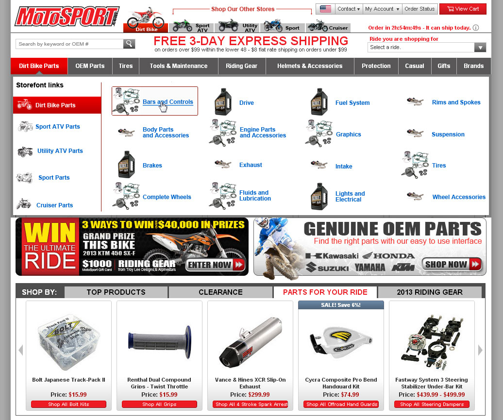
MotoSport Megamenu
We rolled out a new megamenu to help the user find product faster. User tests have shown the menu to be effective.
Megamenus. Wow.
MotoSport Blog Redesign
As the company chose to have an increased focus on original content, the blog redesign was started. This design for a blog category page allows for advertising and content discovery.
MotoSport went through a period of wanting to generate original content, so we made a blog.
MotoSport "Enthusiast" Footer
MotoSport has a very niche market. With this footer we were trying to give a more "enthusiast" feel to the website.
The footer image changed depending upon what type of motorcycle customers were shopping for.
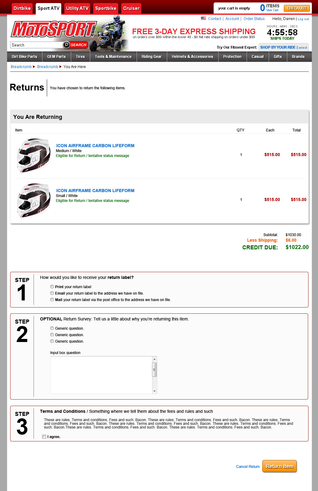
MotoSport Online Return Concept
This was a concept design for what an online returns process might look like. The project was shelved.
Click to see it big. Years later, I'm still pretty happy with this one. Except for those buttons and shadows.
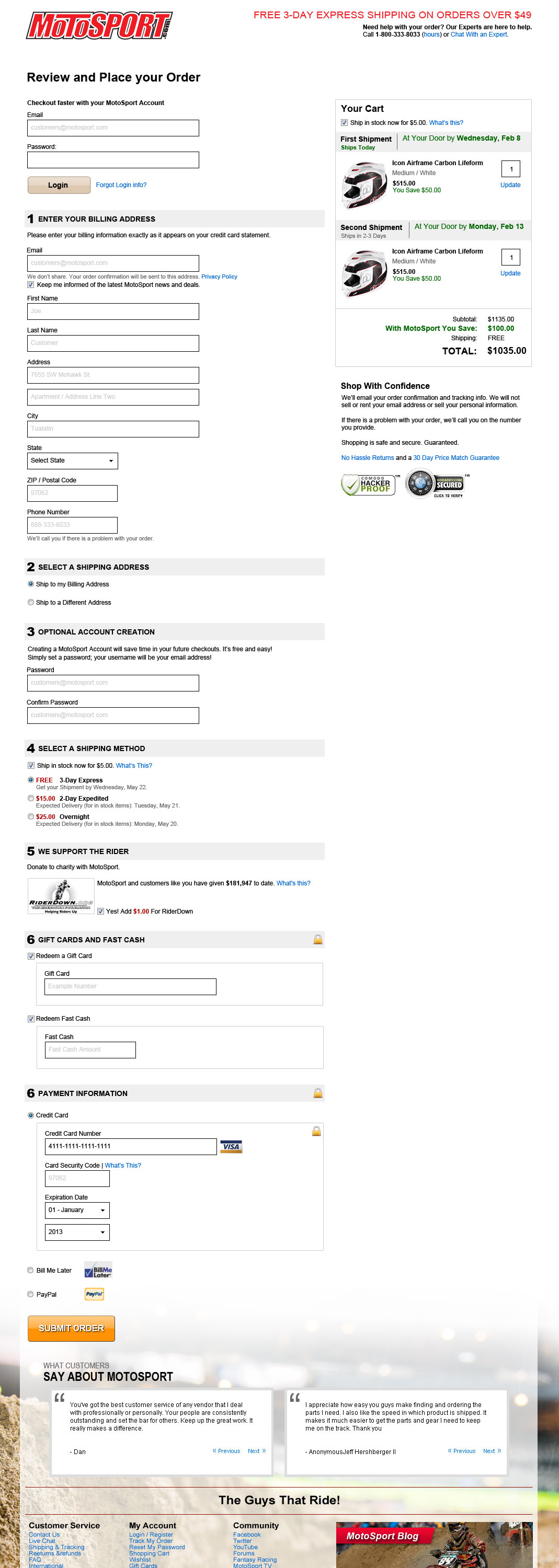
MotoSport.com Checkout Optimization
I was tasked with increasing MotoSport's ecommerce metrics (primarily conversion rate and average order value). A key component of that to create a better flowing checkout process. This is my vision for an optimized checkout flow.
Another big one you can click to see full size. At the time MotoSport had a multi-page checkout process, and had a large abandonment rate. I thought this would improve the abandonment rate.
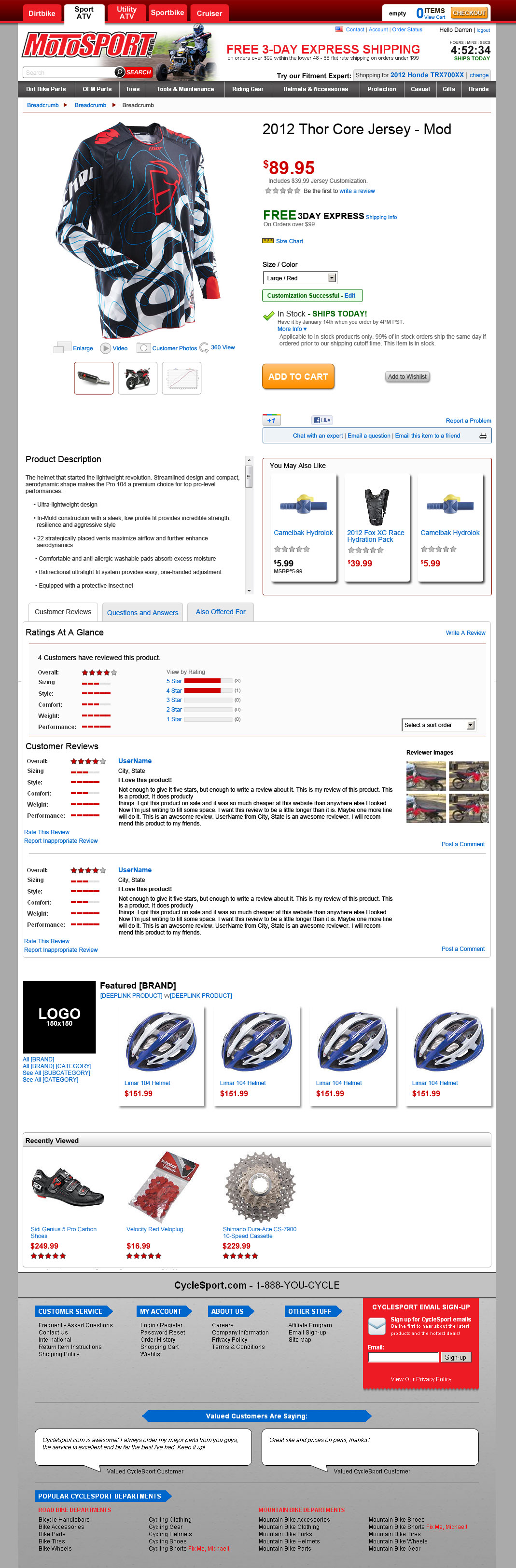
Product Detail Page 2012
One of my first projects at MotoSport was to design a new product detail page. After working with the key players this is the design we chose. It outperformed the old product detail page in an A/B test.
Click to see full size. Product Detail Pages are fun.
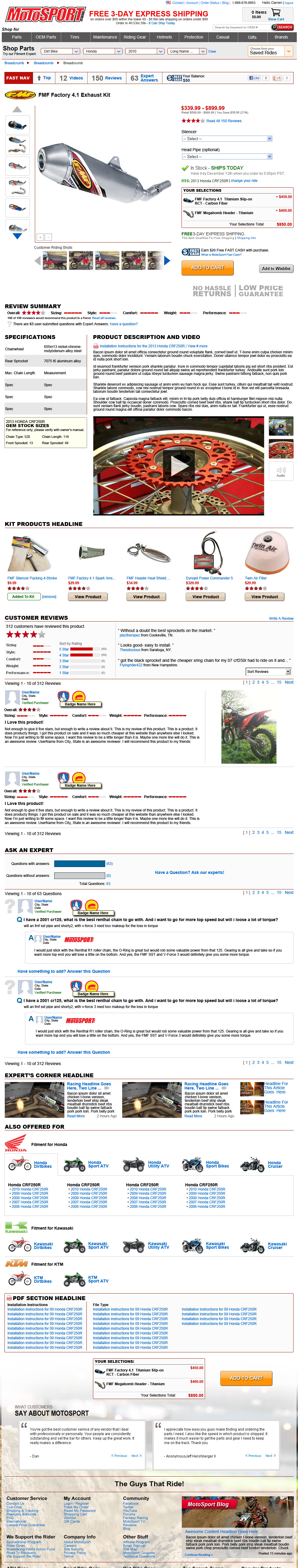
Product Detail Page 2013
There was a desire among management to create a PDP with more content. This is the concept. It builds on the success of the 2012 version and adds additional value. You'll notice a modified motorcycle selector in the header as well.
Click for full size. This one is significantly larger than the 2012 version.
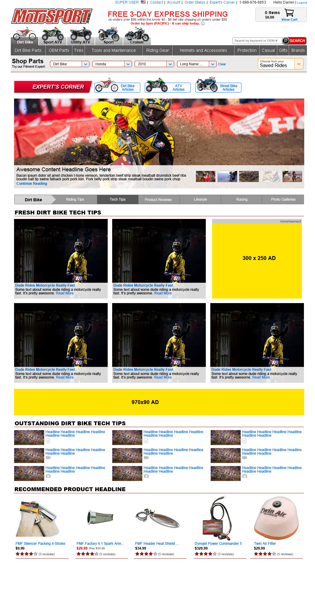
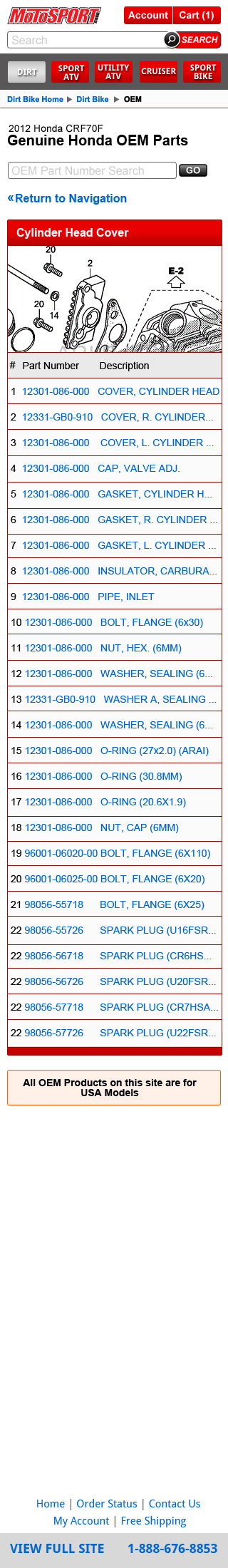
MotoSport Mobile OEM Shopping Experience
MotoSport Mobile is an ever evolving project. The first version of the mobile site was very basic, to prove the concept. We've continued to upgrade it to add more functionality. This is the OEM product listing page concept.
Click to enlarge. At the time, MotoSport was one of the very few websites you could get OEM parts for your motorcycle from. I'm not sure if that's still the case. The OEM system didn't give us a ton of options for ecommerce layout though.
MotoSport Mobile Version 2
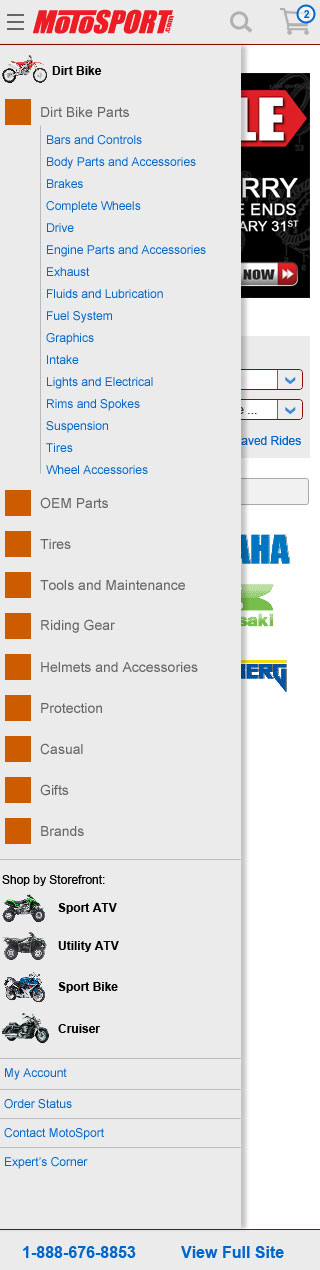
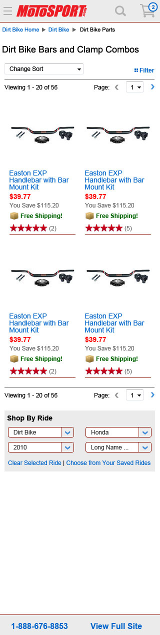
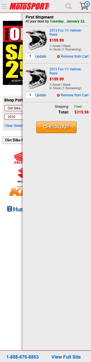
The original mobile version of MotoSport was a stop gap measure. Not everyone was convinced mobile was as essential to the business as it proved to be in the year after we launched the mobile site. The redesign was to build upon the success of the first version while adding the functionality we didn't have time to address last year. The examples here are the primary navigation (where orange represents an icon that hadn't yet been designed), the product listing page and the cart slider.
Click for full size. We had a lot of navigation options.Click for full size. This was a fairly straightforward product listing page.Click for full size. The cart would slide in from the right. How novel.
2007 - 2011
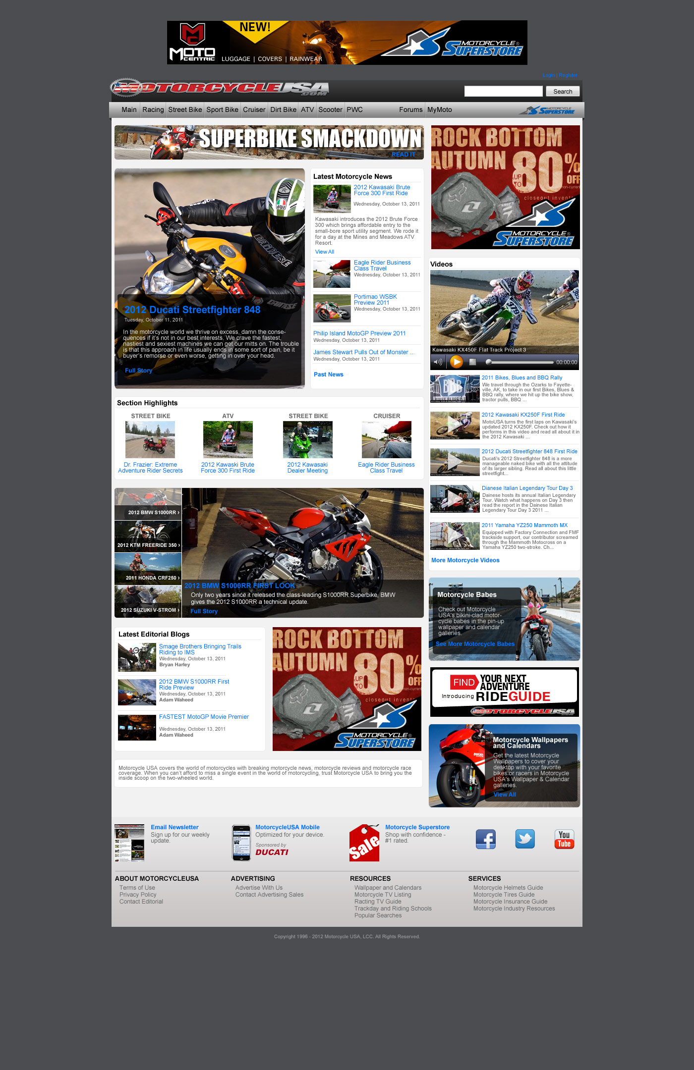
Motorcycle-USA and Motorcycle-Superstore
Motorcycle-USA Redesign Concept
In my final weeks at Motorcycle-USA I began working on the redesign project for the content side of the business. These were very early phase mockups that went unused after I left.
Click for the full size. It's a shame this place shuttered a few years after I left. It was a fun job with a lot of cool people.
Motorcycle Superstore
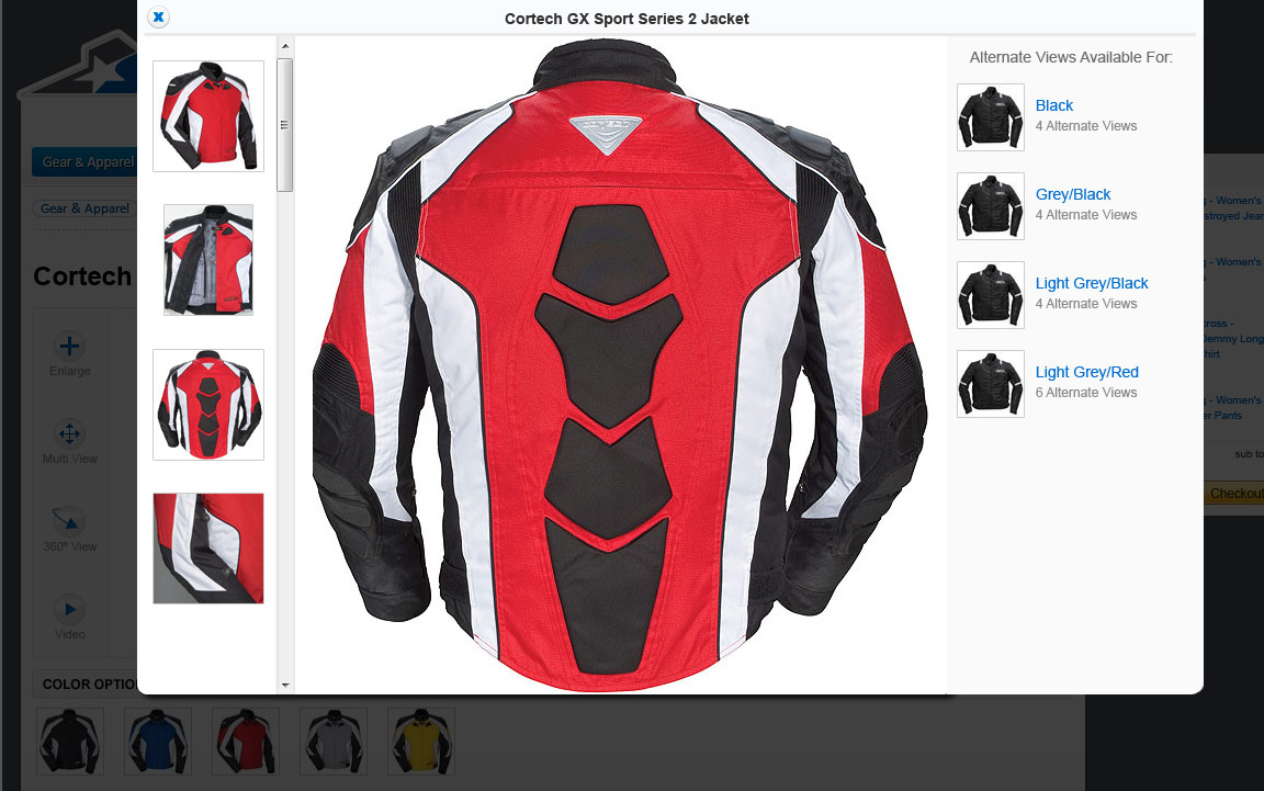
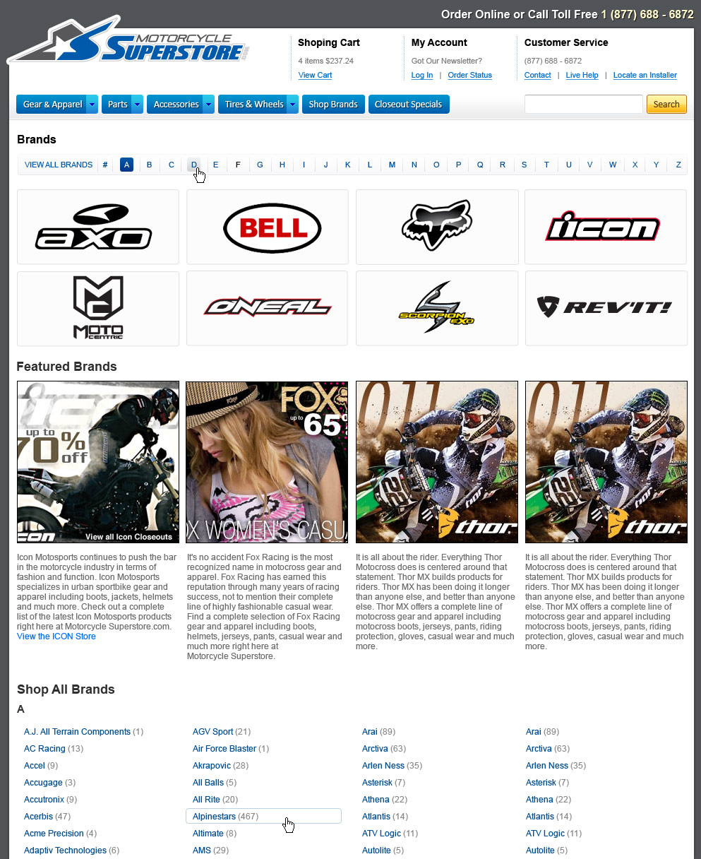
The user experience lead was responsible for the overall look of the Motorcycle Superstore redesign. As the junior user experience designer I was responsible for individual pages and site components. The brands page you see below was a design that was never used. The item multiview modal and the mobile site are currently in use.
This was an item multiview modal, so users could see all the images available for an item.Click for the full size. This was a Brands listing page I designed for part of the 2010 Redesign project.
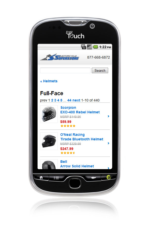
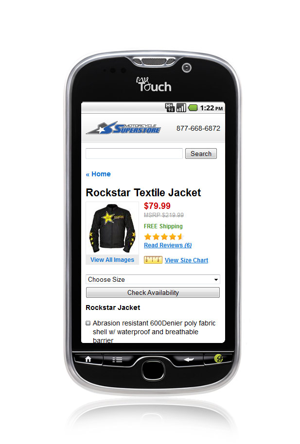
Motorcycle Superstore Mobile
I was tasked with designing a mobile version of Motorcycle Superstore that functioned without javascript and had minimal images, because 2011.
Click for full size. This was the department page, as seen on an old school T-Mobile MyTouch 4G.Click for full size. The Product Detail Page as seen on that same MyTouch 4G.
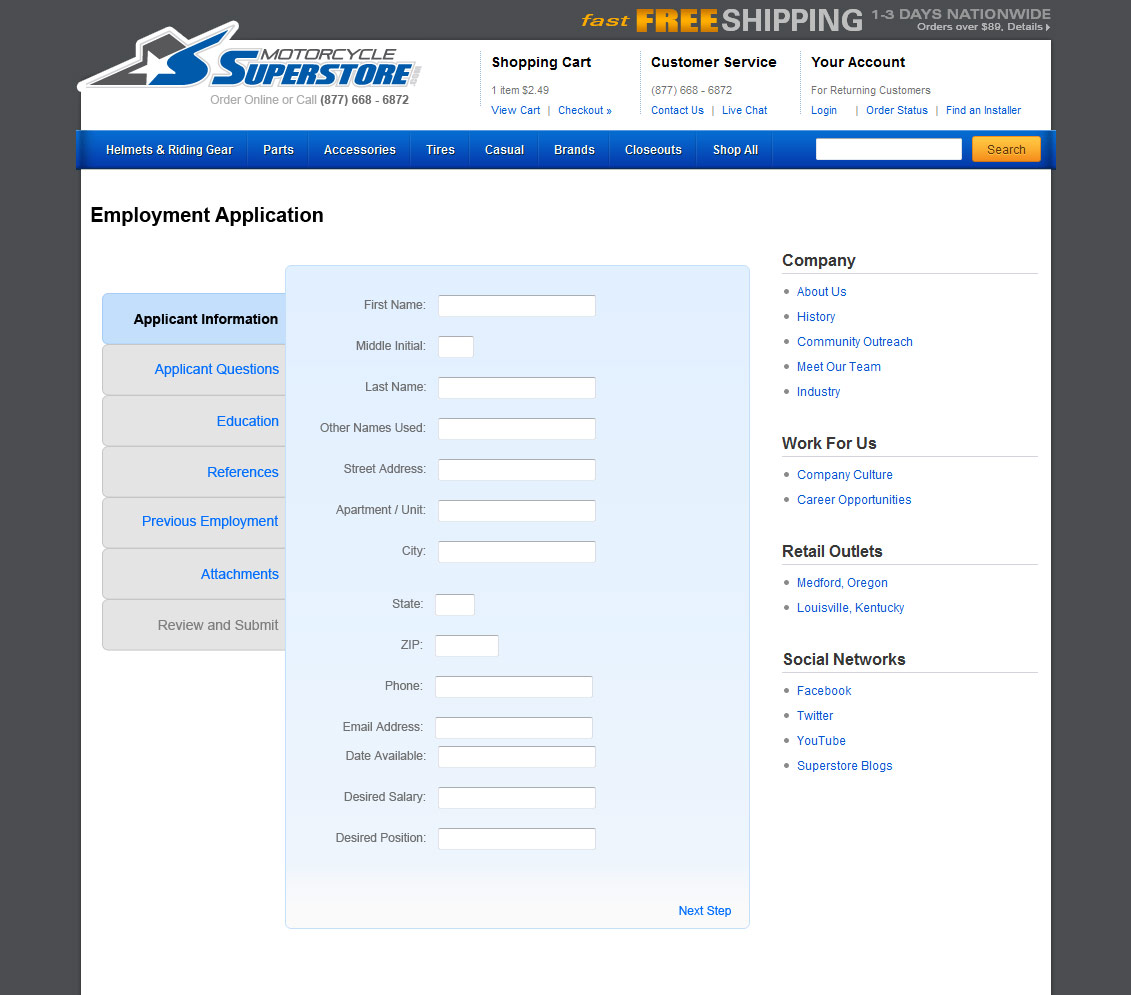
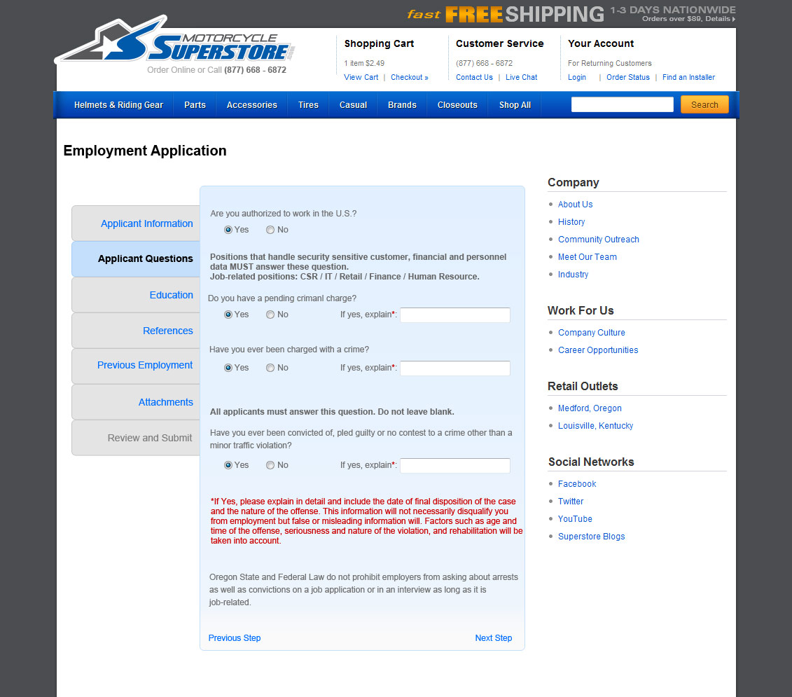
Motorcycle Superstore Application
I designed a new online application for Motorcycle Superstore.
Click for the full size. Remember the days before Taleo and Workday?Click for the full size. Another view of the job application page.