InComm 2017 - 2020
I inherited the Radmin project when I started at InComm in 2017. The early design work was done by a designer who left long before I was hired, and in the absence of a designer some of the product owners had designed some features.
Radmin functions through a micro application API underpinning, which influenced the developers to treat the user interface as a series of micro applications. The initial applications were developed in Angular, each having its own codebase. InComm primarily employed API developers who worked on the front end when they were required to, and each team of developers owned different features, so each micro application front end was vastly different; older parts of Radmin were written in Angular while newer were in React.
Content Audit and Information Architecture
One of the first things I realized I had to do was a content audit. Radmin was designed to handle a lot of functions, and no one could tell me how they were organized or if there was an information architecture. The product team and I set aside some time to work through a content audit. We went to a collaboration space and mapped out everything in the software and on the product roadmap.
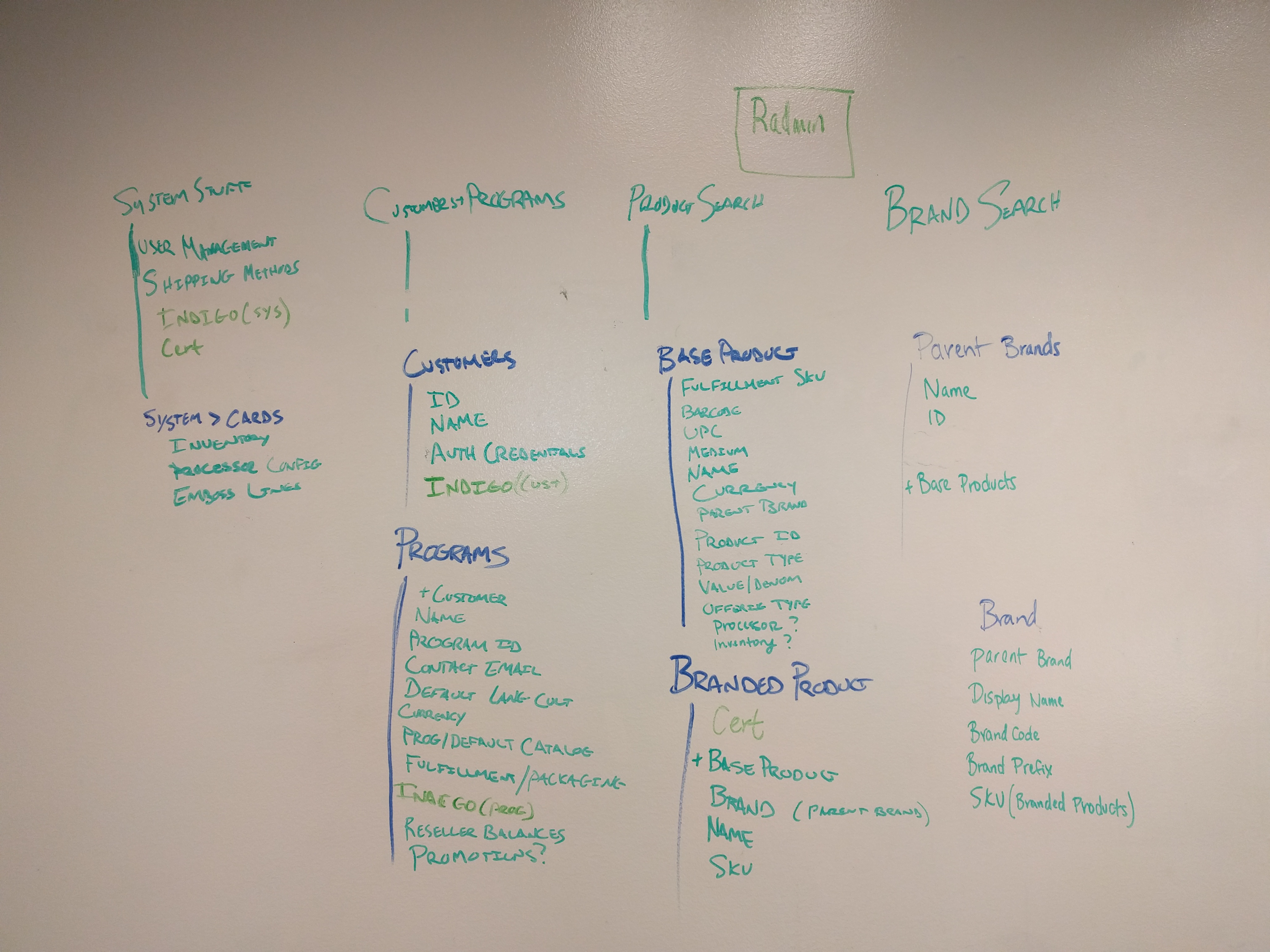
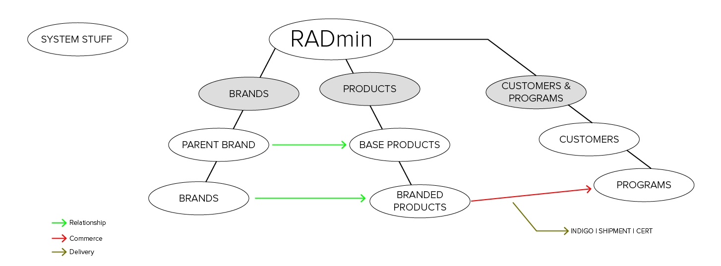
From the content audit, I was able to put together a rough information architecture for Radmin. This was a rough idea of what was in the software and how it related.
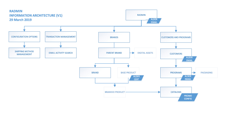
Later on I was able to create a more accurate and up to date version in Visio. This was the master version we referred to when discussing the software with new product team members during onboarding, as well as when we discussed new features.
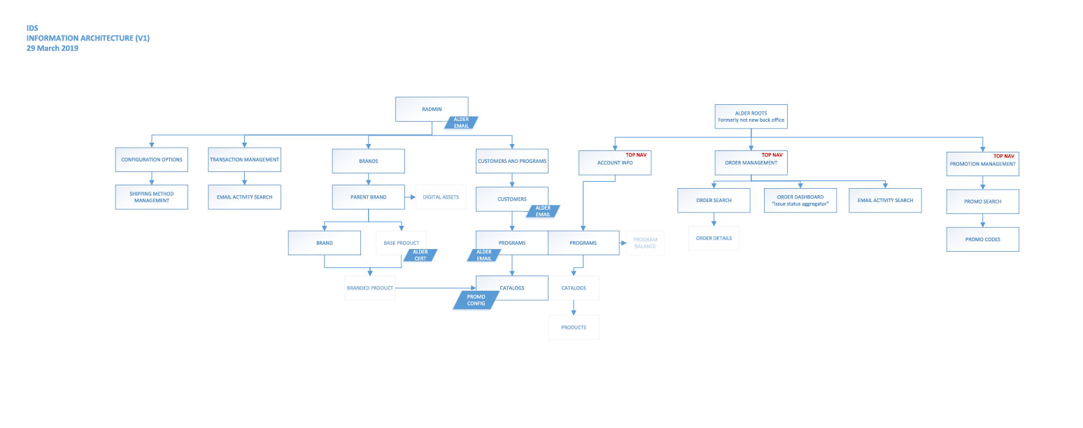
Eventually we discussed replacing another piece of legacy software, but the functionality between Radmin and the two other pieces of legacy software was intermixed. I added an IA for the features we were beginning to map out for the new software, which was intended to be primarily customer facing.
Changes in Design
The issues caused by the split codebases persisted for a while. Eventually a product owner and I were able to push through enough bandwidth to convert many features from Angular to React. While we weren’t able to convert everything, we did get the vast majority of Radmin to React. However, each application continued to have its own codebase.
A result of having multiple codebases and two distinct frameworks was scattershot CSS. Each codebase had CSS files that controlled different things, and each was pulling in a different front end library. At one point the application had 14 different types of buttons. I decided to simplify the buttons, but in the end I had to modify 12 different CSS files.
We decided to create a React component library, which would allow me to write HTML and CSS for all of Radmin and free the developers from worrying about colors and alignment. Converting existing applications to the new component library was a chore, but relatively simple. As a bonsu, the component library could be easily modified to accommodate other applications by simply changing some CSS. Much of the application was written using CSS custom properties (variables), so changing huge chunks of an application’s look and feel was as simple as changing a few variables.
Now that the framework had been laid, design changes required less developer bandwidth and could be done more quickly; sometimes I was able to implement changes into the component library without a developer needing to do any work at all.
I wasn’t able to change everything I wanted about the design, but over time I was able to make things about it better. I was able to get breadcrumbs on the majority of pages, change the buttons to a unified design, fix key usability issues in multiple features and unify existing design components for simplicity.
Parent Brand
There is an important distinction between a parent brand and a brand in Radmin. In the legacy system, each gift card was a unique thing. For example, if Customer Joe sells a $25 Amazon gift card and Customer Sally also sells a $25 Amazon gift card it would require two unique gift cards in the legacy system, each an Amazon card worth $25 with the same card design and legal documentation. In Radmin, that would be the same gift card, with the same assets and documentation.
Further, the parent brand concept allowed us to create simple base products that could be branded in many ways. For example, Darden is a company that owns many restaurant chains. A Darden $25 base product could be branded as a $25 Olive Garden card or a $25 Yard House gift card, each requiring only a single entry into the system.
Each parent brand would contain their child brands as well as the base products those child brands would need to create their individual gift cards (which we called branded products). A base product was essentially a template for a gift card. The end user receives a fully realized branded product without any hints of the complex back end system that created it.
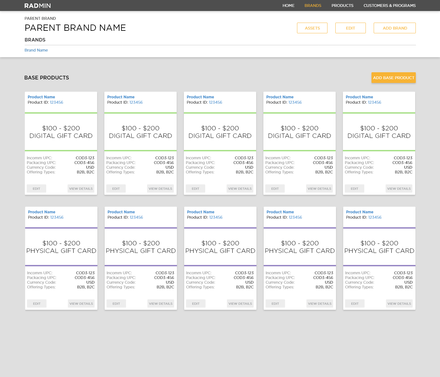
Above you can see the original parent brand page. This example has only a few base products and a single child brand, but the reality of the business was that each parent brand could have many brands associated with it (the average was something like four, but there were extremes that had dozens). Likewise, a parent brand could have a cumbersome number of base products.
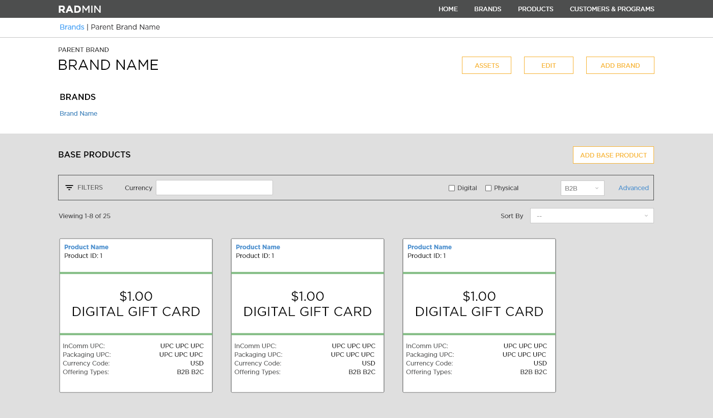
In the newer design we added filtering and search capabilities, based on user feedback. You can also see modifications in the components brought about by the component library, such as the buttons and “card” style layout.
Branded Products
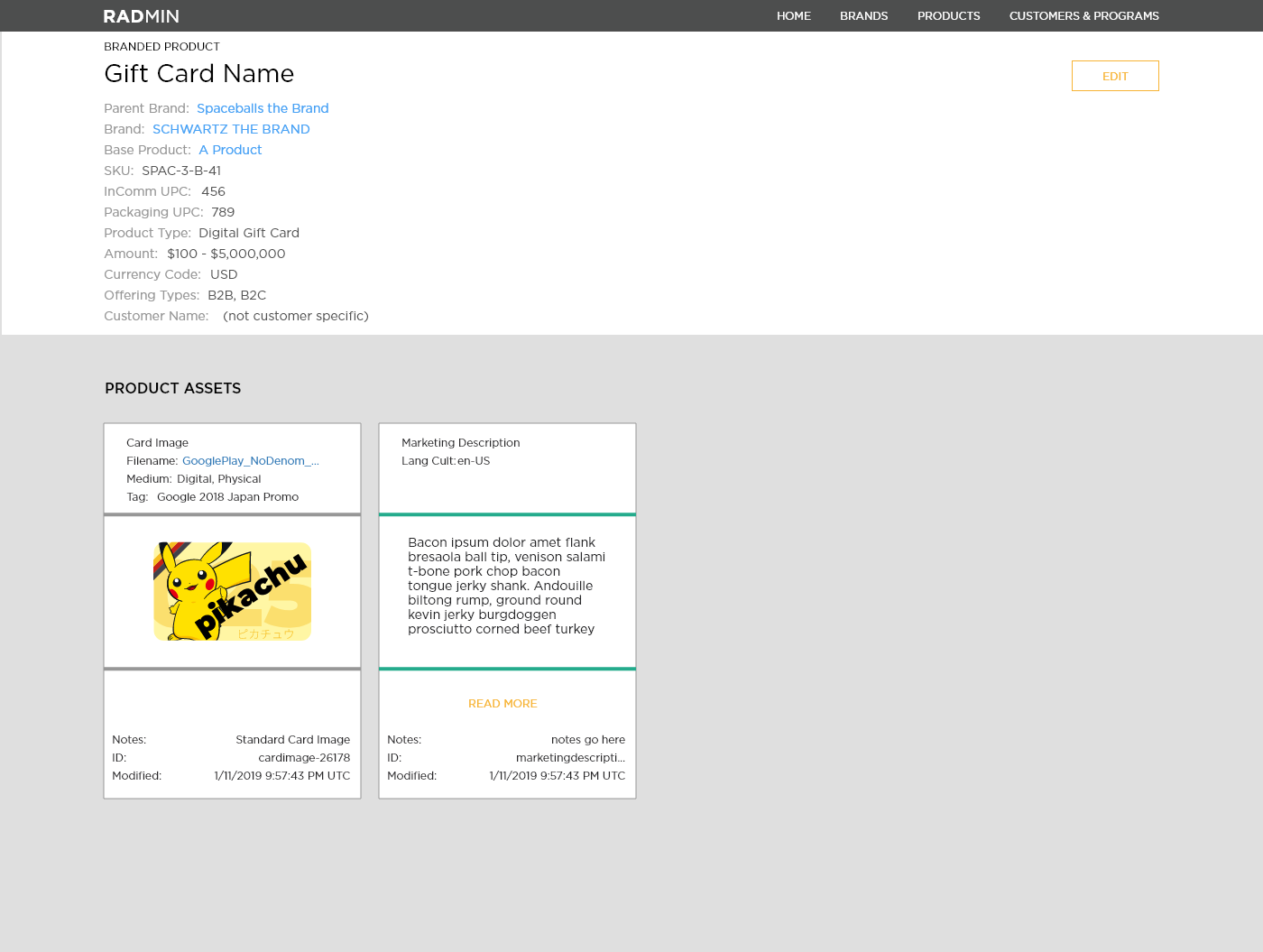
A branded product is the marriage of a base product and a brand, this is the actual product that will be available to customers to purchase from their catalogs. The branded product page allowed employees to view a card and all of the assets associated with it. Assets were required to sell a product, including things such as card image or terms and conditions documentation. From this page branded products could be edited, or have assets assigned to them.
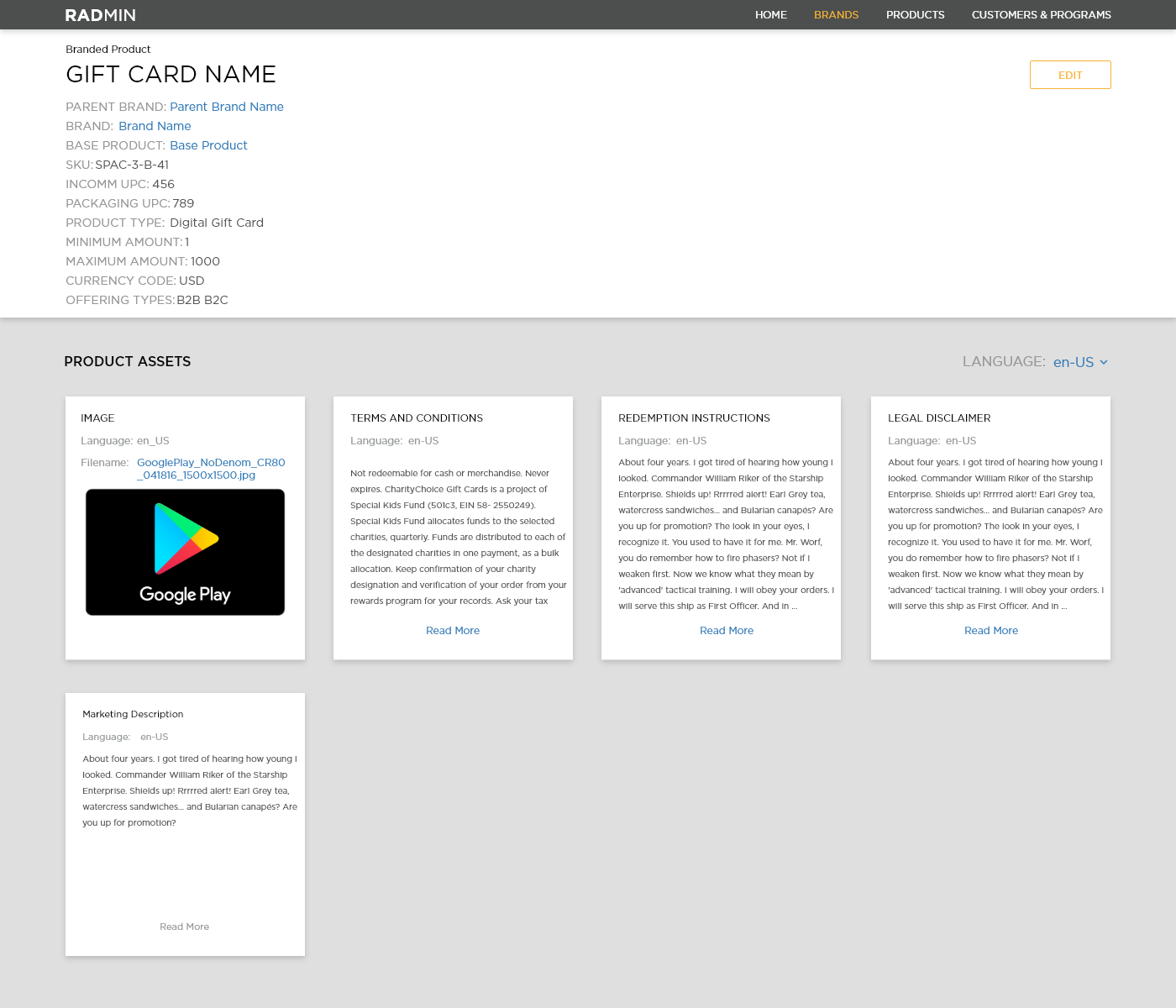
There wasn’t as much change to this page while I worked at InComm. It was originally in Angular (above), but was converted to React (below). The cards were changed to a newer, slimmer style.
Catalog
The catalog page was the heart and blood of the software. Each customer could have multiple catalogs, and each catalog could have hundreds of products for the customer to purchase. Customer orders could be processed through the InComm API or through one of many website based order platforms.
When I started working at InComm the catalog page didn’t do much. Users could add or remove products, and the products were paginated (they could only be viewed 20 items at a time). Over time, this page received the most attention of any single page in Radmin.
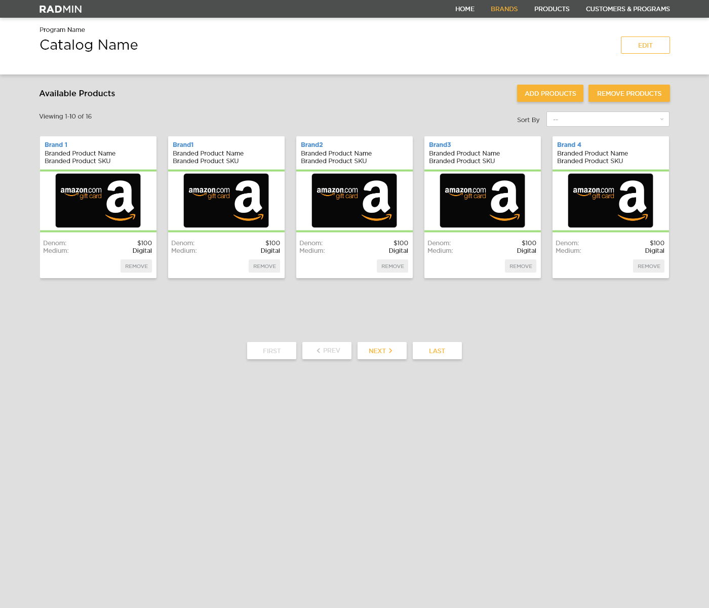
Eventually the amount of information we had to add to this page became a lot to manage. Users didn’t like the pagination, as they needed to be able to view the entire catalog at once. We added searching and filtering capabilities early on.
Later, the amount of information we had to add to the products overwhelmed the “card” style that had been used on the page. I changed the cards to a longer version that was better able to contain the amount of information we needed to show, but even these newer cards were eventually outmatched by the users’ need to see information on this page.
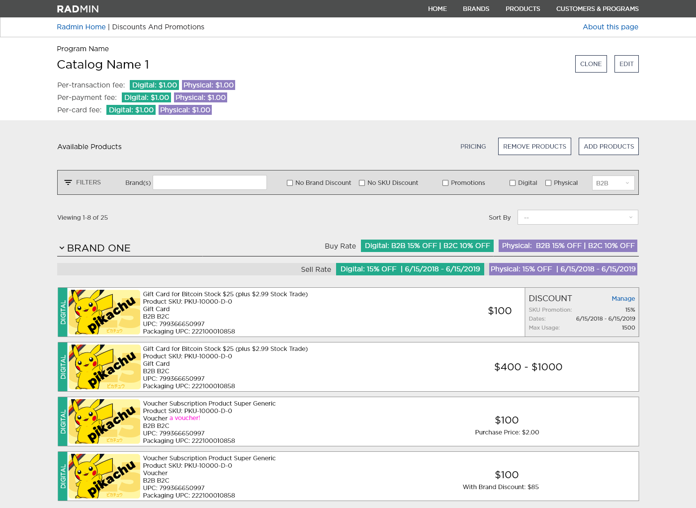
This page had to show all the giftcards in the catalog, pricing information, promotion information and allow for modifying catalog contents.
The design as it stood when I left InComm had all the cards sorted by brand, and each brand was a collapsable area (users could view just the brand names, or the brand names and their products). Searching and filtering allowed users to view subsets of products based on the needs they told us they had (brand name, pricing information, card type).
If I had stayed at InComm this page would have seen more changes. Product and I had discussed creating “lenses,” allowing a user to view product information or pricing information, rather than putting everything into the same view. Unfortunately, we never had the bandwidth to tackle the new work before the COVID-19 layoffs.
Changes Going Forward
In my final weeks and InComm I undertook a large project. We knew Radmin didn’t meet WCAG guidelines for accessibility. It also wasn’t responsive, which was less of an issue as our users were exclusively on desktop computers. However, some of our users liked to rotate their screens 90 degrees, and Radmin didn’t fit well in that orientation.
Radmin was originally designed and built with bootstrap (before it was Angular or React). Some of the original bootstrap CSS remained, including the fixed width container that held everything in place.

I took it upon myself to resolve these issues. As you can see above, I made the header black to increase the contrast of the text to the background (per WCAG). I made the header taller, and removed the fixed width container. I did all of these changes in the React component library and in the design component library, but I wasn’t able to design anything using the changes prior to leaving the company.
After changing the colors of the application I ensured it was responsive down to iPad resolution. Using mostly CSS Flexbox I made sure every major page of the application grew or shrunk appropriately, which would ensure the application would work on anything our users viewed it on.
I previewed the changes to product, developers and the users. The feedback was overwhelmingly positive. However, I was never able to use these new components due to the economic downturn and layoffs caused by COVID-19. Thankfully, these changes exist in the React Component Library so the users and my former coworkers will benefit from the work I did.